Bin there, drank that at MilkUp Moo’seum.
Improving waste-sorting behaviour at a high-traffic Gen Z event.
Overview
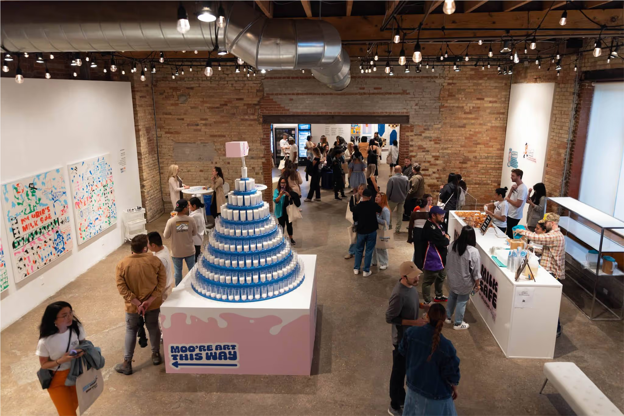
The MilkUp Moo’seum was a Gen Z focused pop-up by Dairy Farmers of Ontario, part of the world’s first post-to-pay campaign. For over a week, a steady stream of guests traded social posts for coffee, ice cream, cheese, and swag.
But half-finished coffees kept ending up in the trash, causing leaky bags, sticky floors, and cleanup chaos.
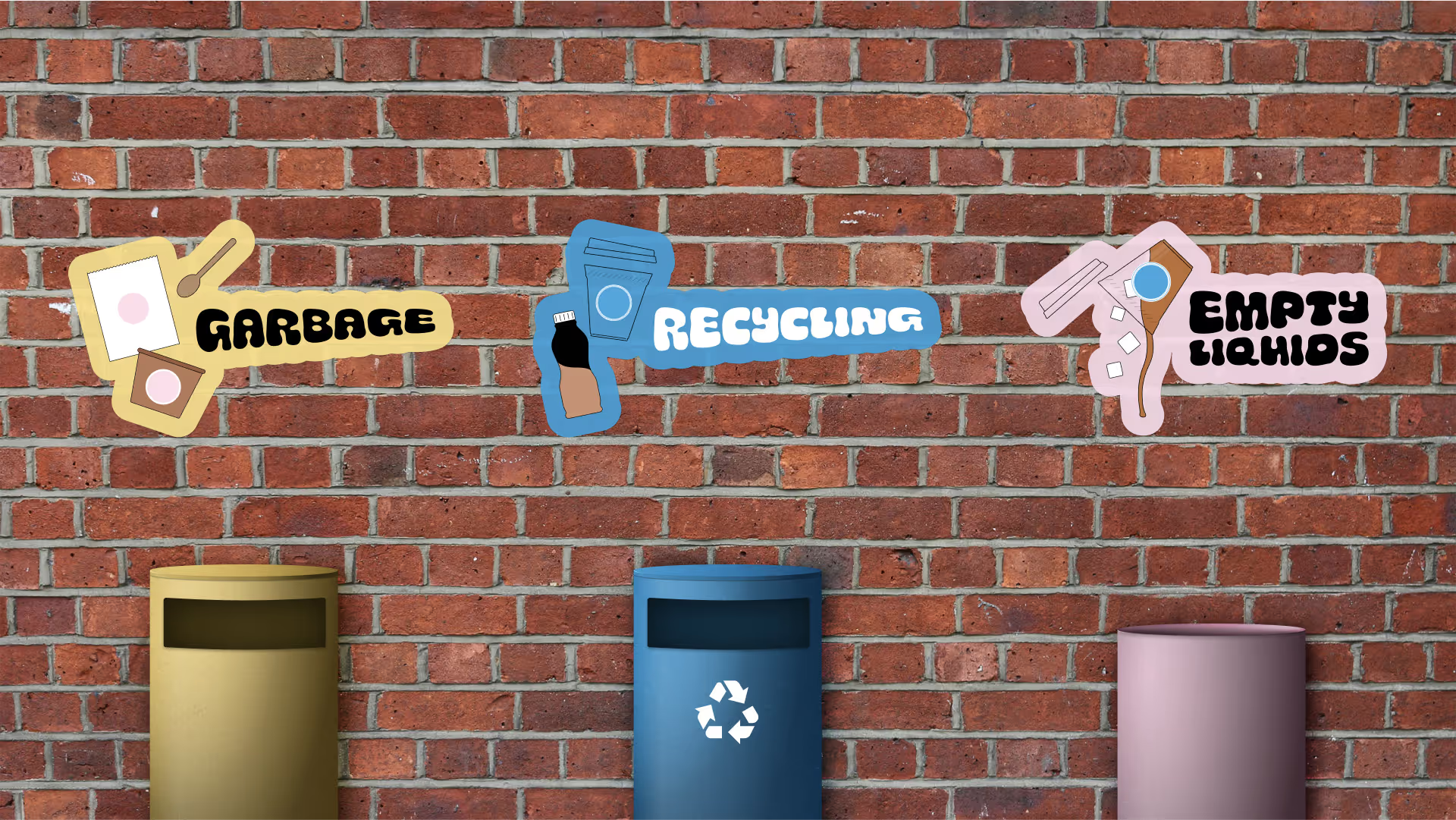
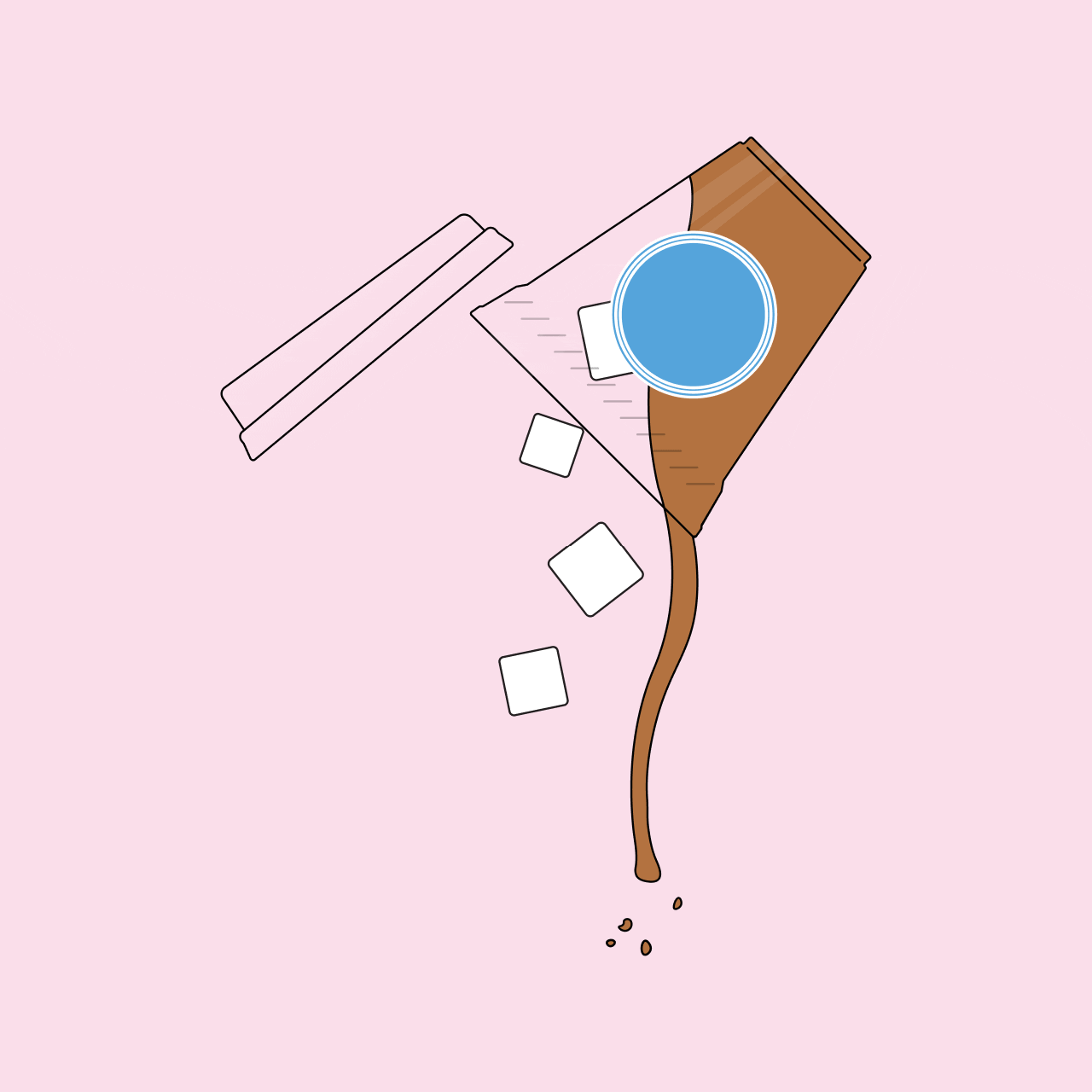
While working the event as a brand ambassador, I noticed the issue and designed simple, illustrated signage overnight between event days. The signs guided guests to sort their waste properly using clear language and Moo’seum’s playful brand style. Sorting improved immediately, bins stayed clean, and the Moo’seum stayed as fresh as the milk
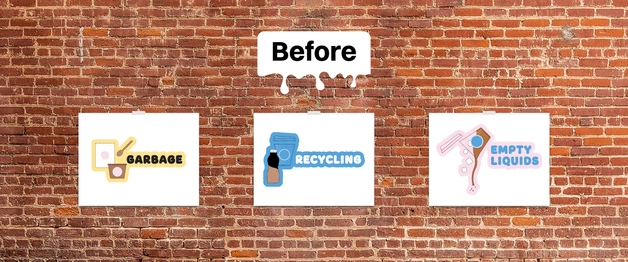
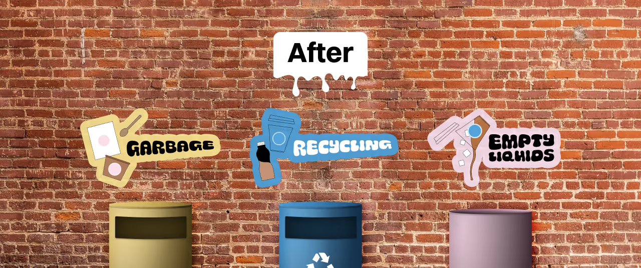
After the event, I recreated the signage using the event’s custom font, pieced together letter by letter from photos, to show how it could look fully integrated into the brand.
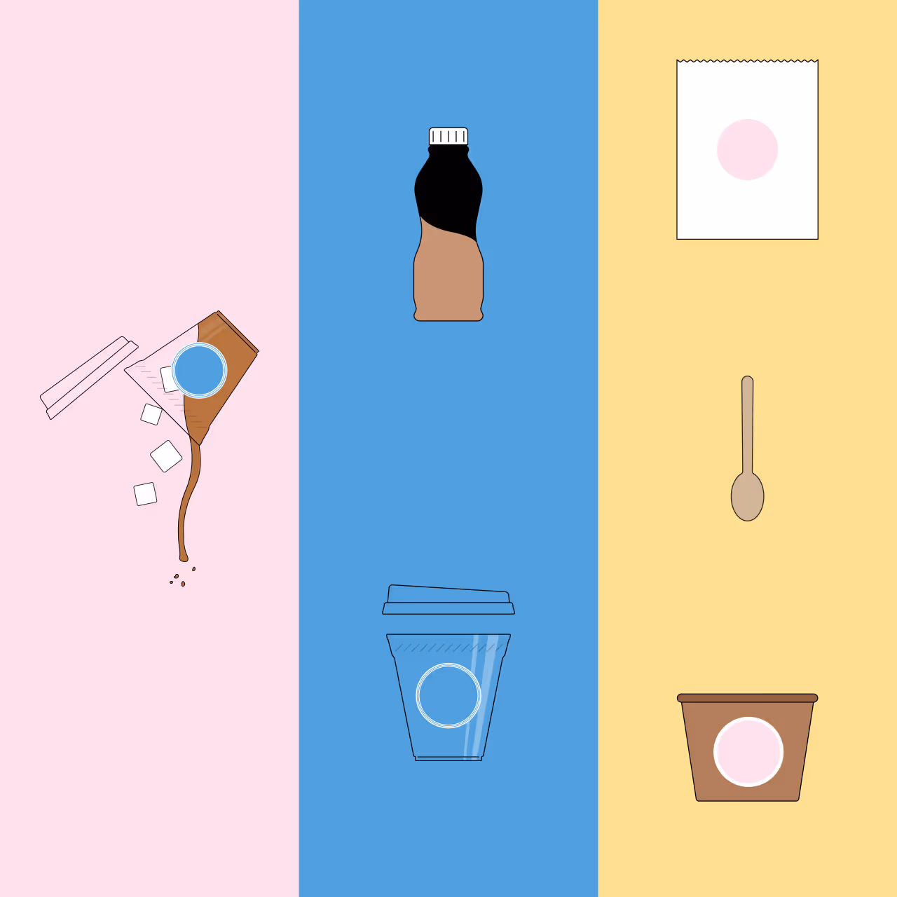
When waste gets overlooked
The Moo’seum was full of colour, music, and Instagram worthy moments. But one common area in events was overlooked: waste.
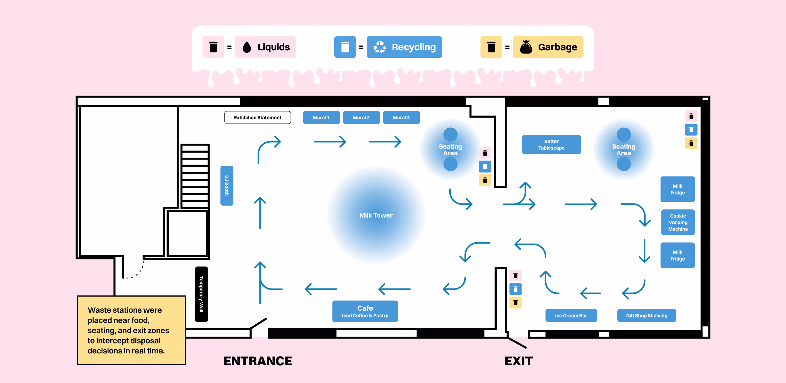
There were no bins for liquids, no signage on how to sort, and a whole lot of dairy fueled Gen Zers wandering around with half-sipped coffees. Naturally, people tossed their unfinished drinks into the trash or recycling—soaking bags, slicking floors, and contaminating waste streams in the process.
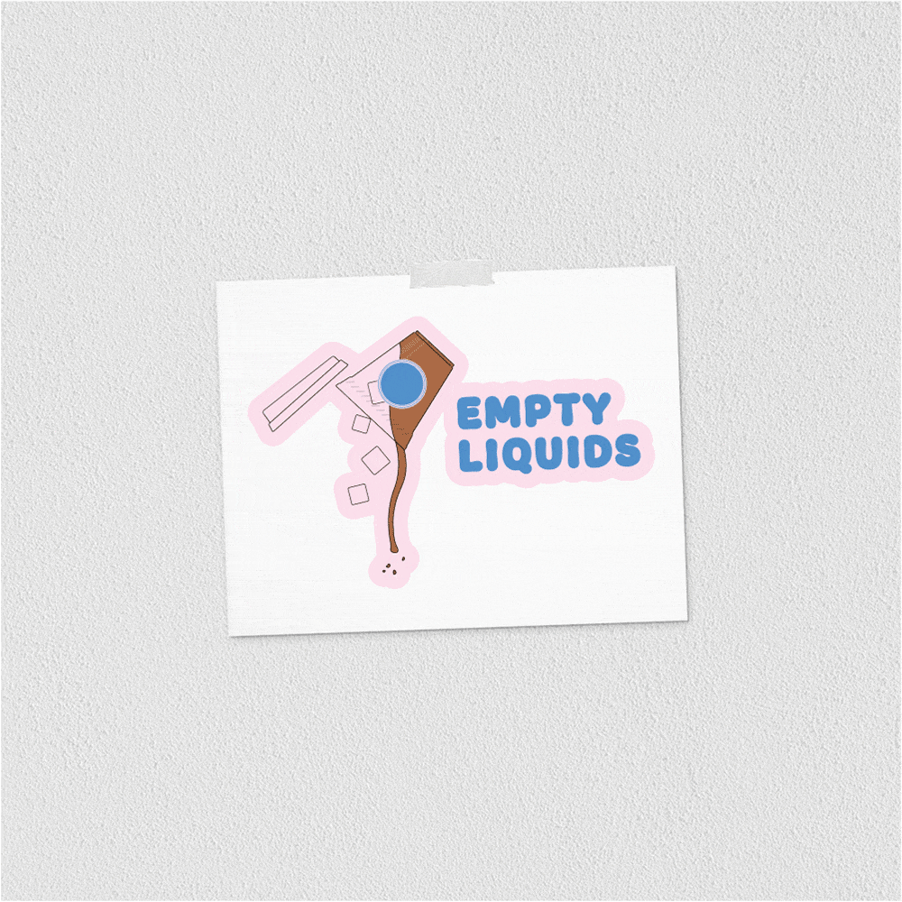
After spotting the drip trail and hearing about a venue complaint, I realized a simple, well designed signage solution could make a big difference.
An udderly quick fix
Waste sorting isn’t second nature, especially in Canada where rules vary by city. Research shows that clear, eye-level signage is one of the most effective ways to improve disposal behaviour.
The first version of these posters was printed on standard letter paper and mounted quickly between event days. It was proof that even a fast, scrappy solution can make a real impact. The refined versions shown here were created after the event to reflect how the signage could look when fully integrated with the brand.
Sorted out
The new signage worked. Guests emptied liquids before tossing, and waste got sorted into the right bins. Coffee hit the liquid bin. Bags stayed dry. Floors stayed clean. And the venue stopped complaining.
A quick fix with a clear outcome: better sorting, less mess, and a smoother experience for everyone.

